如何在安卓中通过扩展 ViewClass 创建自定义加载按钮?
原文:https://www . geeksforgeeks . org/如何在安卓中通过扩展视图类来创建自定义加载按钮/
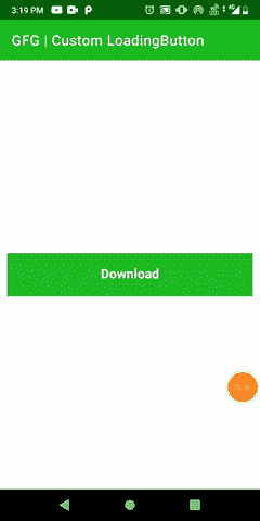
在本文中,我们将通过扩展视图类来创建一个自定义加载按钮,并在单击自定义按钮后设置其属性的动画。我们在下载任何文件并密切关注下载进度时遇到过很多次。在这里,我们将只创建动画自定义按钮。下面给出了一个示例 GIF,以了解我们将在本文中做什么。注意,我们将使用 Kotlin 语言来实现这个项目。
分步实施
第一步:创建新项目
要在安卓工作室创建新项目,请参考如何在安卓工作室创建/启动新项目。注意选择科特林作为编程语言。
第二步:创建一个密封类,按钮状态描述自定义按钮的状态(如点击,加载&完成)。下面是按钮状态. kt 文件的代码。
我的锅
package com.gfg.article.customloadingbutton

// describes the state of the custom button
sealed class ButtonState() {
    object Clicked : ButtonState()   // when button is clicked for downloading
    object Loading : ButtonState()   // when downloading is in progress
    object Completed : ButtonState() // when downloading is finished
}
第三步:创建另一个类,加载按钮,其中与按钮相关的所有内容,如颜色、文本、动画等都将被定义。通过用 JvmOverloads 注释来创建构造函数。下面是 LoadingButton.kt 文件的代码。
我的锅
import android.animation.AnimatorInflater
import android.animation.ValueAnimator
import android.content.Context
import android.graphics.Canvas
import android.graphics.Color
import android.graphics.Paint
import android.graphics.Typeface
import android.util.AttributeSet
import android.view.View
import androidx.core.content.ContextCompat
import com.gfg.article.customloadingbutton.ButtonState
import kotlin.properties.Delegates

class LoadingButton @JvmOverloads constructor(

    context: Context, attrs: AttributeSet? = null, defStyleAttr: Int = 0) : View(context, attrs, defStyleAttr) {

    private var bgColor: Int = Color.BLACK
    private var textColor: Int = Color.BLACK // default color

    // tells the compiler that the value of a variable
    // must never be cached as its value may change outside
    @Volatile
    private var progress: Double = 0.0
    private var valueAnimator: ValueAnimator

    // observes the state of button
    private var buttonState: ButtonState by Delegates.observable(ButtonState.Completed) { p, old, new ->
    }

    private val updateListener = ValueAnimator.AnimatorUpdateListener {
        progress = (it.animatedValue as Float).toDouble()
        invalidate()    // redraw the screen
        requestLayout() // when rectangular progress dimension changes
    }

    // call after downloading is completed
    fun hasCompletedDownload() {
        // cancel the animation when file is downloaded
        valueAnimator.cancel()
        buttonState = ButtonState.Completed
        invalidate()
        requestLayout()
    }

    // initialize
    init {
        isClickable = true
        valueAnimator = AnimatorInflater.loadAnimator(
            context,
            // properties for downloading progress is defined
            R.animator.loading_animation
        ) as ValueAnimator

        valueAnimator.addUpdateListener(updateListener)

        // initialize custom attributes of the button
        val attr = context.theme.obtainStyledAttributes(
            attrs,
            R.styleable.LoadingButton,
            0,
            0
        )
        try {

            // button back-ground color
            bgColor = attr.getColor(
                R.styleable.LoadingButton_bgColor,
                ContextCompat.getColor(context, R.color.purple_200)
            )

            // button text color
            textColor = attr.getColor(
                R.styleable.LoadingButton_textColor,
                ContextCompat.getColor(context, R.color.white)
            )
        } finally {
            // clearing all the data associated with attribute
            attr.recycle()
        }
    }

    // set attributes of paint
    private val paint = Paint(Paint.ANTI_ALIAS_FLAG).apply {
        style = Paint.Style.FILL
        textAlign = Paint.Align.CENTER // button text alignment
        textSize = 55.0f //button text size
        typeface = Typeface.create("", Typeface.BOLD) // button text's font style
    }

    override fun performClick(): Boolean {
        super.performClick()
        if (buttonState == ButtonState.Completed) buttonState = ButtonState.Loading
        animation()

        return true
    }

    // start the animation when button is clicked
    private fun animation() {
        valueAnimator.start()
    }

    override fun onDraw(canvas: Canvas) {
        super.onDraw(canvas)
        paint.strokeWidth = 0f
        paint.color = bgColor
        // draw custom button
        canvas.drawRect(0f, 0f, width.toFloat(), height.toFloat(), paint)

        // to show rectangular progress on custom button while file is downloading
        if (buttonState == ButtonState.Loading) {
            paint.color = Color.parseColor("#004349")
            canvas.drawRect(
                0f, 0f,
                (width * (progress / 100)).toFloat(), height.toFloat(), paint
            )
        }
        // check the button state
        val buttonText = if (buttonState == ButtonState.Loading)
            resources.getString(R.string.loading)  // We are loading as button text
        else resources.getString(R.string.download)// download as button text

        // write the text on custom button
        paint.color = textColor
        canvas.drawText(buttonText, (width / 2).toFloat(), ((height + 30) / 2).toFloat(), paint)
    }

}
第 4 步:使用 XML 文件
导航到应用程序> res >布局> activity_main.xml 并将下面的代码添加到该文件中。下面是 activity_main.xml 文件的代码。
可扩展标记语言
<?xml version="1.0" encoding="utf-8"?>
<androidx.constraintlayout.widget.ConstraintLayout
    xmlns:android="http://schemas.android.com/apk/res/android"
    xmlns:app="http://schemas.android.com/apk/res-auto"
    xmlns:tools="http://schemas.android.com/tools"
    android:layout_width="match_parent"
    android:layout_height="match_parent"
    tools:context=".MainActivity">

    <!--Custom Button-->
    <com.example.customloadingbutton.LoadingButton
        android:id="@+id/custom_button"
        android:layout_width="0dp"
        android:layout_height="60dp"
        android:layout_marginStart="10dp"
        android:layout_marginTop="100dp"
        android:layout_marginEnd="10dp"
        android:layout_marginBottom="100dp"
        app:layout_constraintBottom_toBottomOf="parent"
        app:layout_constraintEnd_toEndOf="parent"
        app:layout_constraintStart_toStartOf="parent"
        app:layout_constraintTop_toTopOf="parent"
        app:textColor="@color/white" />

</androidx.constraintlayout.widget.ConstraintLayout>
attrs.xml (在 res - > values 下)
可扩展标记语言
<?xml version="1.0" encoding="utf-8"?>
<resources>
    <declare-styleable name="LoadingButton">
        <!--create custom attributes for the view-->
        <attr name="bgColor" format="integer" />
        <attr name="textColor" format="integer" />
    </declare-styleable>
</resources>
loading_animation.xml (在 res - >动画师下,在 res 下创建动画师目录)
可扩展标记语言
<?xml version="1.0" encoding="utf-8"?>
<animator
    xmlns:android="http://schemas.android.com/apk/res/android"
    android:duration="2000"
    android:interpolator="@android:anim/accelerate_decelerate_interpolator"
    android:valueFrom="0f"
    android:valueTo="100f"
    android:valueType="floatType" />
步骤 5:使用T2【主活动. kt】文件
转到 MainActivity.kt 文件,参考以下代码。下面是 MainActivity.kt 文件的代码。代码中添加了注释,以更详细地理解代码。
我的锅
import android.os.Bundle
import android.widget.Toast
import androidx.appcompat.app.AppCompatActivity

class MainActivity : AppCompatActivity() {

    lateinit var loadingButton: LoadingButton
    private var complete = false

    override fun onCreate(savedInstanceState: Bundle?) {
        super.onCreate(savedInstanceState)
        setContentView(R.layout.activity_main)

        loadingButton = findViewById(R.id.custom_button)

        loadingButton.setOnClickListener {
            Toast.makeText(this, "File is downloading", Toast.LENGTH_LONG).show()
            complete = true
        }

        if (complete) {
            // call when download completed
            loadingButton.hasCompletedDownload()
        }
    }
}
输出:
源代码: 链接
